We may think that in today’s world of easy access to knowledge that something as visual and data-heavy as the infographic may only be a few decades old. However, the infographic has been around for centuries, even if it wasn’t initially recognized as such. First, we’ll discuss what exactly an infographic is and what purpose it serves and then dig into the rich and surprisingly long history that spans the infographic’s existence, before finally presenting 100 of the best infographics to have been created, and what makes them the best of the best.
What is an Infographic?
At its heart, an infographic is a visual display of data. Traditionally, marketers use it as a means to promote / advertise. It’s a quick and easy visual tool to give the reader plenty of compact information without requiring a lot of reading.
It also makes the data it’s displaying easier to understand. Since 90% of information that’s transmitted to the brain is visual, infographics are a powerful method to educate someone in an efficient amount of time. Because well-created infographics are 30 times more likely to be read than any text, they have a clear goal.
Infographics are primarily used to educate. Whether that education is about a piece of history, a demographic, voting trends in certain states, or a comparison between two stores, the infographic is a medium for information to cross. Because it’s visually compelling–at least effective infographics are–the target audience will walk away knowing something more about the subject at a quick glance. This has been a tool used for centuries.
The Surprisingly Long History of the Infographic
Among the earliest examples of infographics, one was created in the 11th century which depicted the mechanism for planets moving across the sky. It was around the 18th century that infographics began to fully be used. This is due to the fact that before then, there wasn’t a great deal of data collected. No data means there’s nothing to inform. An example used in this period of time was a timeline of historical figures created by Joseph Priestley. The number of biographies was near 2,000.
When the 19th century arrived, infographics were being used in full. Countries were collecting and analyzing new information about the weather, economics, and population. William Playfair is credited with the invention of the famous pie chart and used information about the cost of wheat and wage increase to form an infographic that showed that wages were increasing despite popular belief that the cost of wheat was increasing. He would go on to use infographics to inform the general public, primarily of economic trends.
André-Michel Guerry, in the 1830s, is credited with being among the first to use shadings to demonstrate data. These factual displays were not always accepted since they went against what was held to be true at the time. Infographics also helped when it came to epidemics.

John Snow mapped out the flair-ups of cholera in London in 1854 and was able to see that the bulk of those sick was in the area surrounding a certain water pump on Broad Street. This infographic informed the city council which removed the pump and put an end to the epidemic.

In Civil War history classes, you might have learned about the generals and battles, but it’s likely you didn’t learn about how infographics aided the North to win the war.
A map of Virginia was created which depicted where the highest concentrations of slaves were located–and where they weren’t. Being able to see it visually, President Lincoln devised a plan of pitting eastern Virginia–which had a high concentration of slaves–against western Virginia. The belief was that the western portion of Virginia might not wish to hard so hard for something they did not utilize. This thinking proved fruitful, and West Virginia eventually broke off from the main state to become its own state. President Lincoln would continue to use infographics concerning slave concentrations to suggest to his generals where they might benefit the most staging their battles.
Below is a similar infographic created in 1860, as part of the 8th Census of the United States. It was commissioned by the Department of the Interior to show the distribution of slaves.

Another important figure in history also utilized infographics to change sanitation conditions. Florence Nightingale noticed a trend in sanitation–or lack of–and the increase of deaths in soldiers during the Crimean War. She partnered with William Farr, a statistician, and discovered that her instinct had been right.

Deaths significantly increased due to poor hygiene, more so even than deaths in battle. Nightingale showed this information to Queen Victoria–via a concise, easy-to-understand infographic–and the Queen and Parliament swiftly put in sanitary protocols. The power of the infographic, in this case, managed to change not just the tide of war, but it also set up for a sanitary commission that would last forever.
Obviously, with the creation of the computer and the wide use of the Internet, infographics have become a staple of life. With more data available, more visual representations of these displays are required to inform the general public. What follows is a list of the top 100 infographics.
What Makes a Great Infographic?
For an infographic to be considered great, it not only has to communicate effectively, but it also has to be visually appealing. The graphic in question needs to catch the reader’s attention, inform them, and bolster them to share it on, so the message its conveying can be further carried.
If the infographic can’t take a complex subject and both simplify it and make it easy to understand, then it’s a weak graphic. They were also selected based on expert opinion and experience. Those listed below meet that criteria.
Serif VS Sans

For what could be an incredibly dull subject, breaking up the information and keeping it separated makes the reading of it not only easier but also far more pleasing to view. The two columns work perfectly as a comparative figure and keeping the colors respective to each side promotes clarity.
Time Invention Poll

When there’s a lot of information to get across, using as many images as one can to keep the amount of text limited is crucial. Using the same color themes throughout, as well, creates cohesion and is pleasing to the eye. Simple art aids in the digestion of the facts.
50 Years, 50 Toys

The play to nostalgia is almost always successful. Although this infographic is targeted to a certain audience, it is almost guaranteed to draw them in. Simplicity and using well-known products in the graphic forges an emotional connection between reader and graphic. The colors are muted, letting the images tell the story.
You VS John Paulson
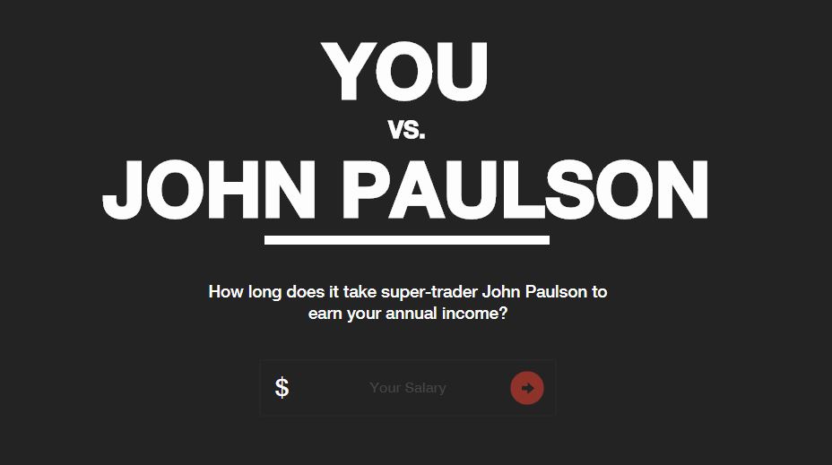
This is probably the Grandfather of interactive infographics. One of the first truly viral infographics to hit the web, You Vs John Paulson created a massive stir back in 2011, and to this day still continues to gather up links for its owner, MahiFX.
Very simple in design, but extremely engaging with the user, and a piece that many brands would kill for.
The Carbon Budget

Although the graphic runs a little long, this piece about the carbon budget packs in a ton of information in a way that keeps the information easy to understand, so the reader doesn’t feel as though they’re being overloaded with information. The art is appealing and the colors are calming.
The Almighty Dollar

The interesting art style of the information for this graphic makes it necessary to add to the list. Using traditional shading to indicate higher densities, the graphic presents the information in a style that is refreshing to look at and quick to understand. Numerous facts bundled into a simple semi-circle.
30 Shots

With a mute background, the colors of the chosen cocktails stand out to the reader, thus drawing their eye to the listed ingredients below. There’s no need for large text or arrows in this case, as the color does all the work. Simple, minimal, and effective in instructing how to make a cocktail.
Feng Shui Infographic

The design of this infographic is a subtle pull on the reader’s gaze downwards, gently suggesting they follow the path of the arrow and read on. It is an effective and delicate mechanism to keep the reader engaged with the information presented and encourage them to keep following the facts.
3D Agriculture

Not the sexiest of niches on the web, but this agricultural holding company produced something pretty decent and that attracted a lot of links. It presents a complicated data about the business with bright images that communicates information about the company quickly which is super easy to consume.
North American Butterflies

Adding animation to an infographic can make it even more entertaining and appealing to the reader. The wings of the butterflies flutter as the reader learns about what they are and where they are from in the world. The background is muted, allowing for the butterflies themselves to draw in the reader.
Social Media Images Sizes Cheat Sheet

I’ve put one of my own in here not because I think that its an incredible piece of work, but because of the simplicity of it and how well its done in terms of attractive hundred of links to my domain.
Infographics don’t need to be flashy or interactive to be a successful link magnet.
Typography Infographic
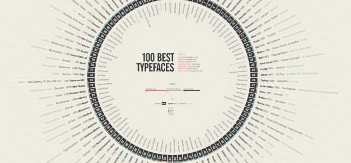
A beautifully designed infographic about the 100 best typefaces. It explain very well the basics of typography and displays the “best” ones and the most popular fonts used.
Birds of North America

An excellent visual resource of the Birds of North America. Well designed and illustrated as well as being amazingly comprehensive. Such diversity of colors and shapes in the infographic, makes it truly beautiful.
There’s a whole lot going on in this graphic, but because it doesn’t clog a great deal of text along with the images, it doesn’t appear overwhelming. Readers can take a quick glance, spot a few birds they recognize or are interested in by image alone and discover their names.
Bloomberg Billionaires

I love this interactive infographic. Once more, the white-on-black combination allures the reader’s eye to the faces of those they may or may not recognize. Cleverly, their names are placed just below the face in the event the reader is not familiar with their image, and their money is written in an eye-catching red just above that.
Bloomberg manages to do content really well, and this piece is no different. It’s generated loads of links and shares, which is what graphic aimed to do. Not really that well optimised for SEO, but I don’t think that was the point of the interactive infographic.
Behind The Internet Curtain
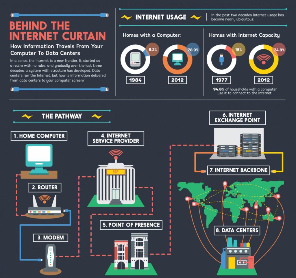
This infographic makes the list for displaying how powerful white text can be on non-black, dark backgrounds. Black and white can sometimes read as too harsh for the eyes, or could even be considered boring. Using a dark shade with white text ensures that the text can be read easily.
Caffeine in Popular Products

I love how infographics can promote change in people’s behaviours by educating them. This one does just that.
Take a long hard look at this piece. If you have any of these beverages on a daily or weekly basis, then you need to take stock and change your ways! Really well designed. The data is on point and well communicated to the viewer.
Sangria

Infographics can sometimes be an artist’s dream challenge. By adding in fun art, the artist not only tells the story of the information that needs to be passed along but allows the reader to enjoy the process of learning it. Fun art can be just as impactful as bar graphs.
Cheetah: Nature’s Speed Machine

A three column design is a treat to the eye. The symbols used aids in triggering memory and impacts to the reader, especially in terms of the sports cars, just how fast a cheetah can really run. The use of the speedometer on the right reinforces the topic at hand.
Creative Routines of Successful People

Using two keys to quickly explain the following graphs gives the reader all they need to know at a glance. The use of the clock as a design to show how each creative figure used their time is both a practical and creative choice. Images of the figures aids in gaining interest.
History of Life

This unique design of displaying data utilizes splashes of color to emphasize certain sections of the information they’re giving. They also add humor to keep the reader interested and engaged. Minimizing the art and keeping a lot of grey space, in this example, makes the graphic clean and professional looking.
The Best Careers For Your Personality Types

We can see color psychology come into play with this infographic, as well. This time, they’ve chosen to use the colors that they believe are core to the personality types. Using the color that correlates with personality in the presentation is a sneaky and intelligent way of adding more information.
What Is The Deep Web?

Using the topic of the graphic as a metaphor to create the art is done cleverly here. Not only does it make it an entertaining piece to read, but the visuals almost seem to tell a story the further the reader’s eye moves down. Masterfully created for fun and education.
Daily Routines of Famous Creative People

Similar to the previous infographic, this data concerns itself with the routine of certain individuals instead of the creative process. It also chose to use a bar graph with indicated colors rather than a clock design. The choice of font is legible and stark enough to bring the reader’s attention.
Evolution Of The Video Game Controller
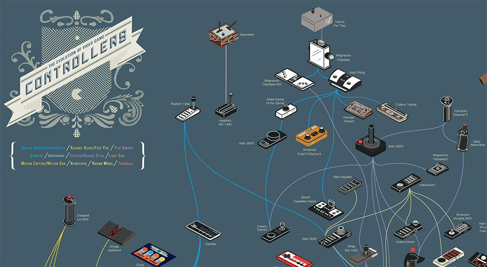
As far as I am concerned, this is possibly my favourite infographic ever. It appeals to people like me (gamers, geeks and born in the late 70s, early 80s) as it’s just a work of art and provides a nostalgic journey into our childhoods.
“The Evolution of Video Game Controllers” is the handy work of Pop Chart Lab that produced the “complete family tree of video game control schemes . This includes joysticks, handhelds, paddles, gamepads, and a gaming glove.”
Every Active Satellite Orbiting Earth

Another interactive piece, this infographic boasts displaying every satellite orbiting the Earth. Although the circles can seem a bit daunting in number, the graphic carefully uses soft colors so as not to strain the eye and plots it against a numbered graph to help in comprehension of distance to Earth.
The Chart Video Game Controllers

If this was just text-based information, the list of controllers would become tedious and unremarkable. However, the infographic provides a picture of each controller described, complimenting name and image, aiding in memorization. The graphic also details a design of a classic controller, using its colors throughout the entire piece cohesively.
Prolonged Sitting & Standing

Some of the most difficult pieces of information to simplify and explain are medical topics. This graphic carefully uses art and models to help break those medical terms down. The careful placement of the art makes the information read downwards similar to the shape of a spine–engaging, simple and informative.
Know Your Chakras

Using the right backdrop, as in this case, can aid in reinforcing the message the infographic is attempting to send. As in this case, it shows the locations of specific chakras. A dark background with colorful images catches the eye and draws it to the information most required to understand.
What Code Should I Learn?

The careful blocking and separating of information can aid when there’s just too much information to be put smoothly on a single infographic. Not only does this allow the reader a break in their reading and scanning of the image, but the spacing makes it easy to refer back to.
What Is GMO?

The appropriate and eye-catching background of this infographic lets it make the list. Utilizing the topic to promote the background, the dark color allows for bright text and cool colors designed to ensnare rather than strain the eye. Careful placement of arrows guides the reader’s eye to the information smoothly.
The Psychology of Handwriting You Are What You Write

This infographic makes the list because of the artful use of the topic’s theme as the main draw to the eye. Using cool and attractive colors, the pen not only emphasizes the graphic’s topic, but it is oriented in a way that guides the reader’s eye down to the bottom.
How Google Works

Tale Of Two Cows

Sometimes humor is the best way to present new information. Since people don’t like to be wrong about their beliefs, a way to combat that shield is through satirical humor. This graphic displays that in an effective way that entertains, informs, and just has a bit of fun with itself.
Funnel Inc Factory

This fun graphic harkens to the Where’s Waldo? books that so many enjoyed. The play to nostalgia can appeal to readers, and this graphic, in particular, allows the reader to work their way through the story of information by following the carefully placed red arrows. It’s a trail of knowledge!
Hip Hop Blueprint

Almost works of art in themselves, this infographic displays the branching of music within the genre of Hip Hop. It allows the reader to easily follow the influences and branching off of certain genres within an overarching musical style. Large bubbles allow the reader some reprieve from the visual journey.
The ABC of design

A really well designed infographic that list the a to z of design elements.
The Beatles – Who Wrote Most Of The Songs

For those inclined to the best of music, an infographic can easily display something similar to that shown here. Analyzing who wrote the most songs in the Beatles, this graphic doubles the information by including what year they wrote the song as well. Colors keep it engaging and easy to follow the arrows.
Taxonomy Of Rap Names

Once more displaying how relationships can easily be followed via visual graphics, this infographic devotes its analysis to the breakdown of what goes into rap names. Amusing and easy to follow, the graphics use colors in their branches to make sure the reader doesn’t get lost amid all the information.
Common MythConceptions

Simple symbols grab the reader’s eye while using short and simple text to get the information across is used in this infographic. The teaser used with the header before each blurb of data also entices the reader’s interest and curiosity. The headers are effective enough that the following text could be arbitrary.
Famous Writers’ Sleep Habits

Another examination of the habits of famous figures in history, this graphic places its key right at the top for the reader to examine. Following that, the information is set out in a readable bar graph design with personal portraits done by an artist to entice the reader’s eye to each figure.
Fantastical Fictive Beers

Information and fun are not always exclusive. This piece shows how creativity can also inform and allow the reader to have a good time. The neutral background allows each bottle to stand out, the colorful labels on each bringing the reader’s attention right to the joke presented on each bottle.
Fastest Ship in the Universe

This interesting piece mixes fact with fiction. Beginning with a factual speed, it uses science and math to calculate the proposed speed of following fictional spaceships afterward. With images of each ship in question, readers can recognize ships they know and perhaps be prompted to investigate others they don’t further.
Flight Videos Deconstructed

The animation of this infographic is almost hypnotizing. The movement alone charms the reader to discover the information carefully placed right beside each image. The use of the color purple is pleasant to the eye, and the contrasting pinks and oranges to demonstrate flight makes the movement of wings clear.
Flights in the Sky

Perhaps one of the best interactive infographics ever made, this selection not only gives information about aviation travel, it does so live. The information was fresh, accurate and accessible anytime. If that weren’t enough, this graphic also showed the traffic of aviation for the past 100 years, too. That’s a lot of data.
The graphic is unfortunately no longer available on The Guardian website, but was made using data from FlightStats. Today, we can get similar information using well developed tools like FlightRadar that provide similar data in real time.
Food and Wine Pairings

For those who enjoy the finer things in life, or for those planning a well-earned night out, this chart helps identify the perfect wine pairings for whatever meal is being consumed. The chart-style makes reading the graphic easy, and the color makes it both attractive and adds to the functionality.
Gay Rights in the U.S. — State by State

The radial design of this infographic makes navigating its information simple. The use of colors of the rainbow harkens to the graphic’s subject matter. Visually examining just how unprotected certain people are in the United States can create empathy in the reader. This is the sort of graphic that inspires rallies.
Geography of Hate

Infographics can be controversial as well. This interactive piece covers hateful speech via Tweets. Those Tweets are then located and placed on the map for the reader’s viewing pleasure. If pleasure can even be had with the shocking information this graphic provides. This data can certainly spark up a conversation.
As of 2023, the full interactive map is no longer available on the home website, floatingsheep.org.
How A Car Engine Works

For those who didn’t grow up with a dad eager to teach how to fix up a car, this graphic beautifully details how a car engine works. The moving pieces are attention-grabbing, and the use of color helps in breaking down each section. The blueprint design is appropriate and elegant.
How a Handgun Works

Similar to the car engine, this piece explains how a handgun works when firing a round. Again, the blueprint style of the design gives an attractive edge to the graphic. The use of colors to highlight the section being described allows the reader to easily follow along and understand the concepts.
Parrott Model

For word lovers out there, this is a fascinating infographic about emotion and the words that describe them. Or, rather, points out the emotions that do not have words to describe them. The use of bubbles and branches easily shows correlations, and the graphic as a whole is incredibly in depth.
How Common Is Your Birthday?

One way to establish a connection with another person is sharing the same birthday. This graphic goes into incredible detail about how popular a day is for being born. Using the traditional shading method to indicate high quantities, the graph also provides additional details about the day, including conception date.
How Far is it to Mars?

This really clever site was made by the highly creative David Paliwoda. It shows the user exactly how far Mars is from Earth. It does it by presenting the distance in a metric most Internet users can grasp…. pixels. So if the Earth was a 100 pixels wide, how far would Mars be?
History of the 100m

How Fast Is LAFD

In a place where wildfires can sometimes run rampant, knowing just how long the fire department will take to reach a specific location is extremely important. This map goes into extreme detail to display the response time and even suggests that location is rather important. Certainly leaves something to be desired.
How Many People Do Drones Kill?

Relying on emotion and shock factor, this graphic takes the reader through the story of how many people are killed by drones in a given year. Breaking down the deaths from targeted individuals to civilians and children, this graphic was designed to invoke a response from its audience and does so well.
How Much Do Music Artists Earn Online?

How Often Do The French Kiss?

This fun piece prepares travelers for the likelihood of being kissed as a greeting in the country of France. With carefully selected shades of color, this map goes into great detail once the reader zooms in a bit more. How this data was collected is a graphic all its own.
How Steve Jobs Started

This unique transition from a radial display to a flowchart is a fun path that leads readers through the life of Steve Jobs. Litle stick figures give a break from the text and keep the reader moving onto the next section. The graphic doesn’t shy away from the ugly facts.
How to Be Productive

The giant word productive is the immediate draw in this infographic. Colorful lines easily pull the reader down their twisting paths to each section. Colors differentiate between different methods the reader can be productive, and the use of symbols to lead into the text make this graphic a quick read.
How to Build a Dog

Another graphic packed full of information, this one concerns itself with how to make certain breeds of dogs. The bar graphs display how much of a certain breed of dog exists in another. While the use of columns gives the reader a bit of information about certain breeds of dogs.
How to Build a Human

With the spiraling motion this graphic boasts, the reader is almost instantly hypnotized and pulled towards the center. The eye follows the path of a simple egg and sperm cell to a fully grown baby in this graphic depicting the stages of human growth in the womb. Fascinating and relevant.
Kitchen Cheat Sheet

Sometimes infographics are so helpful, they need to be made into a poster and hung for all to see. For anyone just starting to cook at home or just can’t bother to memorize all of the conversions necessary for some of the cooking instructions, this graphic is perfect to use.
How-Many Guide to Kitchen Conversions

Another beautiful conversion chart, this graphic is elegant and straight to the point. No unnecessary text gets in the way of the information. Just a quick look, a path along the dotted line, and the reader has the answer they’re looking for. This is another graphic that would be perfect in the kitchen.
Hungry Tech Giants: 15 Years of Acquisitions

This clever infographic is packed with data, nicely packaged in an interactive, visually gentle table. You can hover over the circles in the graph to open up clickable links to articles and data about large acquisitions of the tech behemoths. Users can scroll into the graph with their mouse scroll wheel to expand out the graph. Its nicely packaged and very usable.
Poppy

The art of this infographic is absolutely stunning and relevant to the topic its displaying. In fact, the art was inspired by a poem. Using poetry or literature to influence the art of a graphic can not only make the learning enjoyable but can also be a visually appreciative experience.
In Caffeine We Trust

Is Life Good?

This infographic is so simple, it’s in a class all its own. Six shapes and eight words are all it takes to potentially make a profound statement and change someone’s life. Useful for whenever one is feeling down or unsure about one’s place in life. Motivational and inspiring, this graphic does it.
Is Your Startup Idea Already Taken

By using simple nouns and businesses the reader is likely already familiar with, this graphic informs them of businesses that already exist with that idea in mind. A quick and easy way to determine if the reader is just going to waste their money creating a business that already exists.
Facebook Psychology

If the data concerns something that has a color theme, like the site in this example, then designing the infographic to mimic the match the color theme is an effective way to relate back to the topic. Multiple different fonts can also keep the reader engaged in the text portion.
Is Your State’s Highest Paid Employee a Coach?

A question within a message is the goal of this infographic. By looking at the states, the reader can determine who is receiving the bulk of the money. The information transitions into a question, or perhaps a few questions, that the reader might generate. Why do we pay that profession so much?
Ketchup + 17 Clean Ingredients – Every Condiment You Will Ever Need

When Are Fruits In Season?

Kitchen 101: Pasta

Late Bloomers — Late In Life Success

Million Lines of Code

Morning Rituals of Inspirational Entrepreneurs

One part motivational, second part curiosity quencher, this graphic highlights some of the morning rituals of a few select successful entrepreneurs. Not only do the pictures aid with memorization and attraction, but the personal quotes adds in establishing a connection to the entrepreneur in question. Perhaps this might inspire new morning rituals for all.
Most Common Use of Time

With the ability to view data based on gender, age, and choosing the timeframe, this interactive graphic provides a lot of information that can be quite telling of our society. Where society tends to spend the bulk of their time could be considered either healthy or worrisome and may inspire change.
What Matters Most to People Around the World

The key to this graphic is they chose to place the key to the color map throughout the graphic. Too many scrollings can make a reader decide to scroll on past, so giving them reminders of what means what can make sure that they stay on target with the information.
Omnibus of Superpowers

There’s a lot of superpowers out there, and this graphic aids in distinguishing not only the different powers available but also in organizing them by color in the seven categories they list. The colors also keep with the theme popular in superhero comic books, using the same selections of color.
Planet Earth Control Deck

For science fiction nerds, this graphic is for them. A considerable amount of information about space placed inside of a spaceship’s control frame. It leans heavy on a familiar Star Trek Next Gen design, to instantly connect with your inner geek.
It’s utterly cool and fun and does well in informing the reader about certain aspects of space. The moving images help to place the reader in the story.
Snake Oil Supplements

With the craze about certain supplements that may be good or may not help at all, this infographic takes the lead in giving the reader the chance to understand what supplements and what they do with a quick click. The bubbles are organized by the strength of evidence, an informative strategy.
Soup Recipes

The beautiful aspect of this graphic is the use of images as not only a tool to educate but to attract as well. Although it would be wise to read the graphic in full, readers can take a quick look at the image of ingredients for the soup and cook away.
The Billion Dollar Gram

The Charted Cheese Wheel

Everyone needs a cheese chart. This infographic literally tells all the reader could ever wish to know about where their cheese comes from, what it looks like, the texture, and the official name. The radial design allows for readability and the images can help a reader find the cheese they’re looking for through visual alone.
Hip Hop Artists’ Unique Words Used

This incredibly interesting infographic documents the number of unique words used by a rapper within their first 35,000 lyrics. Who has the best use and diction of the English language? The graphic will inform of that as well as how they compare to famous author Shakespeare, and the book Moby Dick.
The Empire State Building Light Show Decoder

The Essential Herb & Food Pairing Guide

Like wine pairings, herbs have their pairings for food as well. This graphic displays with ease the best pairings for certain foods and herbs. The clever use of symbols to use as check marks adds to the attraction, and the doubling of the key at the top and bottom make for quick reference.
The Evolution Of The Batman Logo

Whether it’s historical evolution, automobile evolution, or in this case, Batman logo evolution, the timeline infographic is always a classic. The gray background allows the dark, infamous, symbol to take the lead. Font associated with Batman is used to give the year and origin of the logo, making it appear all the more nostalgic.
The Evolution of the Web

This graphic provided an elaborate timeline displaying the evolution of the world wide web since 1993. It illustrated major changes in application and in the evolution of different browsers in a fantastic style. Unfortunately this is another great piece of work that is no longer live in 2023.
History Of Color

This graphic is all art style, relying on funny cartoons to amuse and inform the reader. All one could ever wish to know about color is presented here. Although there is additional text at the bottom, the graphic itself does an excellent job of informing the reader the origin of color.
Timeline of History

We’re Getting Good at Going to Mars

What Do Brand Colors Say About Your Business?

What’s the Top Data Dog?

What’s Warming the World

VIEW HERE
By Bloomberg
When is the Best Time to Buy Everything

Which Marvel Characters Murder Most?

Why Sitting is Killing You

Why Your Brain Craves Infographics

An awesome example of an interactive graphic built with HTML5 and CSS3. There’s a lot of interactive infographics that look great but lack in actual interesting and engaging content. This one is both great looking and has a fascinating subject matter.
Wind Map

Although the original is interactive, this image of a wind map is a new trick on an old visual. The white on black choice for the wind allows the reader to really examine the weather patterns. Adding in a few easily recognizable cities ensures the reader isn’t lost in the map.
The Deadliest Animals

Ready to take the next step?
If you’ve been inspired to create your own infographic by my list of the best infographics ever made, then there’s so many tools out there to help you produce awesome results.
Publishing your own infographics can drastically increase web traffic to your website as well as improve your rankings by attracting natural links.
Jamie Spencer
Latest posts by Jamie Spencer (see all)
- How To Make Money As A Kid In 2025 – 6 to 16 Years Old - December 9, 2025
- 17 Of The Best Google Adsense Alternatives 2025 - October 13, 2025
- How to Start a Successful Cryptocurrency Website - September 12, 2024
I also remember seeing a very old chart from WWI or II, which showed – in thick arrows & snaking lines – the no of troops who moved East & West from UK-France and from Russia-Poland into Germany & the region, with some returning, some dying due to disease and cold and some settling in the respective regions that they found peace (and a mate!). If you locate it, please send to me
Hi Jamie, it’s a great collection but no mention of modern infographics godfather Fritz Kahn in your top 100? A bit like leaving da Vinci out of the 100 greatest artists…
Best Wishes
Andrew
I’ll put it in there.